Last Updated on September 4, 2025 by Val Razo
In today’s saturated digital landscape, a strong visual identity is more than a luxury—it’s a necessity. If your Instagram feed feels disjointed or lacks a consistent vibe, your brand’s visual identity could be suffering. Fortunately, Instagram’s latest innovation—the AI Auto Palette Generator—acts like a digital styling consultant to help you create a cohesive Instagram aesthetic that reflects your brand and resonates with your target audience.
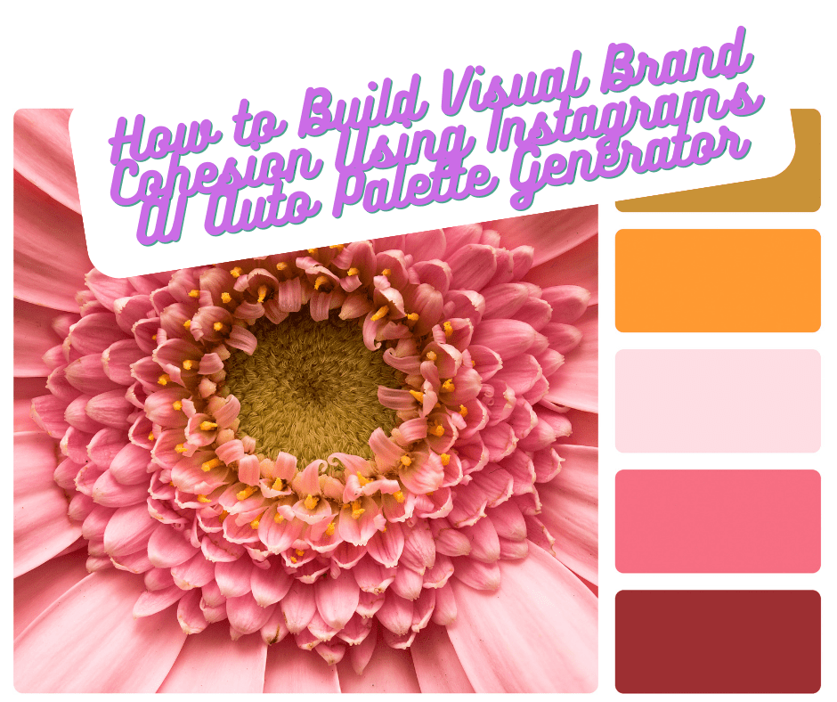
This step-by-step guide will show you how to align your visual elements, such as color palette, fonts, and filters, to create an instantly recognizable and visually consistent experience across your social media posts. Whether you’re building a minimalist aesthetic or a vibrant brand presence, the right combination of color schemes and tools like Canva templates can help build brand recognition and boost engagement.
Ready to discover how an AI digital styling consultant enhances your social media presence? Let’s dive into the best practices for building a cohesive visual that not only looks beautiful but also works strategically to elevate your brand.
Understanding Instagram Aesthetics and Visual Branding
What Is an Instagram Aesthetic and Why It Matters
Your Instagram aesthetic is the visual language that communicates your brand’s personality, values, and vibe in a single glance. It includes your color palette, filters, typography, and how your social media posts are arranged on your Instagram feed. This aesthetic is often the first thing people notice, and it significantly impacts whether they follow you, engage with your content, or click away.
A cohesive Instagram aesthetic does more than look good — it builds trust and strengthens your brand recognition. When your content is visually consistent, it creates a strong visual identity that feels polished and professional. This is especially important for brands trying to establish authority or connect with a target audience on a visual-first platform like Instagram.
Aesthetic is key to digital storytelling. A well-executed visual identity encourages deeper emotional connection by appealing to users on a subconscious level. Over time, this consistency becomes part of your brand’s personality—helping people see your brand and immediately associate it with a feeling or value.
Whether you lean into a minimalist vibe or a bold, colorful style, keeping your visual identity across your Instagram stories, grid, and highlights unified is crucial for creating a cohesive and instantly recognizable online presence.
When I first started building my brand on Instagram, I focused too much on each individual post and not enough on how everything looked together. Once I started using planning tools and applied a consistent color palette, my engagement doubled in just a few weeks. That’s when I realized the power of visual branding done right.
Aligning Visual Identity With Brand Guidelines
To maintain brand consistency, your Instagram aesthetic should be directly tied to your existing brand guidelines. These typically define elements like:
-
Your official logo and placement
-
Primary and secondary color schemes
-
Approved fonts and typography hierarchies
-
Image and photography styles
-
Preferred tone and personality in visuals
Applying these elements to your Instagram profile ensures your brand’s visual identity is aligned across every platform. Your audience should experience the same look and feel whether they visit your website, open your app, or scroll through your Instagram feed.
Templates are a powerful tool in maintaining visual alignment. Using tools like Canva, you can create reusable social media templates that simplify post creation while keeping everything on-brand. These templates should reflect your chosen colors, font, and visual style—and can easily be customized for promotions, testimonials, or storytelling.
Incorporating Instagram’s AI Auto Palette Generator into this process takes things even further. This intelligent tool helps you create a cohesive and visually consistent aesthetic based on your existing content, giving you curated suggestions that work together to create a refined, on-brand look.
In short, the goal is to make your brand instantly recognizable, build emotional familiarity, and help your brand stay visually consistent — all while enhancing your social media marketing strategy.
The Role of Color Schemes in Brand Identity
How Color Influences Perception on Social Media
Color is one of the most powerful tools in defining your brand’s identity. In the fast-paced world of social media feeds, color helps your posts stand out while communicating mood, tone, and values. Whether you realize it or not, your audience is making snap judgments based on the color scheme of your content — and those judgments affect how they interact with your social media presence.
Different hues evoke different emotions. Blues suggest trust and calm, reds signal energy and urgency, while earth tones can give off a natural or minimalist feel. When used consistently, your color schemes help create a sense of familiarity and recognition. This emotional resonance strengthens your visual brand cohesion and makes your content more engaging.
But color doesn’t just impact emotions — it also impacts behavior. According to studies, using a consistent palette can boost engagement and increase brand recall by up to 80%. On a visual-first platform like Instagram, this means your chosen colors are doing more than decorating your grid — they’re helping create a strong brand from the inside out.
Choosing the Right Palette for Your Brand Visual Identity
Selecting the perfect color combinations for your Instagram theme can feel overwhelming, especially with so many styles and trends in play. But the key is to choose colors that not only look great together, but also align with your brand values and audience expectations.
Start by identifying your brand’s core personality. Are you bold and edgy, soft and approachable, modern and minimal? Once that’s clear, look at your current branding assets — like your logo, website, and packaging — to extract the dominant visual elements. These become the base for your Instagram aesthetic.
Here’s where Instagram’s AI Auto Palette Generator shines. This smart tool analyzes your existing content and suggests cohesive color groupings that reflect your brand. It acts as a digital styling consultant, ensuring all your visuals work harmoniously, especially when combined with templates in tools like Canva or your preferred social media templates.
A few best practices for building your color scheme:
-
Limit your palette to 3–5 main colors for consistency
-
Include a neutral background or accent to break up your feed
-
Use the same tones in your Instagram stories, highlights, and grid posts
-
Test your palette in a mockup using social media content tools before publishing
Consistency in color is crucial for maintaining brand consistency and helping your content feel like it all belongs together. Done right, your color palette will serve as a visual cue — subtly but powerfully reminding your audience that they’re engaging with your brand, even before they see your logo or read a caption.

Step-by-Step Guide to Using Instagram’s AI Auto Palette Generator
Accessing and Activating the AI Palette Tool
Instagram has started rolling out its AI Auto Palette Generator, an intuitive feature designed to help creators and brands build a cohesive Instagram aesthetic using intelligent color palette suggestions. This tool is especially helpful for those looking to refine their brand’s visual identity without hiring a full-time designer.
To access the tool:
-
Open Instagram and go to your profile.
-
Tap the + icon to create a new post or story.
-
Select an image or video and tap into the editing tools.
-
In the filter/color section, look for the “AI Palette” or “Smart Styling” option.
-
Tap to enable and let Instagram analyze your content for suggested palettes.
This feature works as a digital styling consultant—scanning your existing content and proposing color combinations that align with your overall visual identity. The palette suggestions are based on factors like dominant hues, brand style, and even performance metrics from your top posts.
Customizing Your Color Selections for Brand Cohesion
Once the AI has generated your palette, it’s time to personalize. While the tool offers curated options, it’s essential that your final selections align with your brand values and audience expectations. Ask yourself:
-
Does this palette reflect the emotions I want my brand to convey?
-
Do these colors work with my logo, templates, and existing visual elements?
-
Will this color combination maintain a consistent visual style across stories, posts, and highlights?
You can adjust saturation, brightness, and contrast to fine-tune the colors. If you’re using tools like Canva, take the generated palette and input it directly into your social media templates for a seamless visual rollout. This ensures your posts, Reels, and Instagram Stories all share a cohesive look.
Remember, consistency is key. The more visually aligned your content is, the easier it is to create a cohesive Instagram presence that feels polished and professional.
After testing Instagram’s AI Auto Palette Generator, I noticed how much easier it became to keep my feed on-brand. Instead of second-guessing every color choice, I could trust the AI to match the tone of my brand while saving me hours of editing time.
Best Practices for AI-Generated Instagram Themes
To get the most out of the AI Auto Palette Generator, keep these best practices in mind:
-
Use the same palette across at least 9–12 posts to create a unified grid
-
Save your selected colors as brand presets in your editing or design tools
-
Preview your Instagram feed using planning apps to ensure visual flow
-
Combine AI palette suggestions with your existing brand guidelines to stay authentic
-
Don’t overcomplicate — sometimes a minimalist approach yields the most powerful results
This AI tool helps you work together to create a cohesive visual style that enhances your social media presence with personalized aesthetic support. By following these steps, you’ll not only create a strong brand identity, but also develop an Instagram theme that’s instantly recognizable and visually striking — even at a glance.

Creating a Strong Brand Through Visual Consistency
Grid Planning and Maintaining Aesthetic Flow
One of the most important strategies for building a cohesive Instagram aesthetic is intentional grid planning. The way your posts are arranged on your profile — your Instagram theme — affects how users perceive your brand from the very first click. When done right, it enhances your brand identity, improves navigation, and makes your content more instantly recognizable.
To start planning effectively:
-
Use a layout tool or planner like Canva, UNUM, or Preview
-
Design posts in advance using your chosen color palette, fonts, and imagery
-
Arrange images in patterns (row by row, checkerboard, or puzzle-style)
-
Create templates that support this flow and reduce design time
Grid planning helps you maintain a consistent style even as your content varies in subject. Whether you’re sharing promotions, quotes, behind-the-scenes shots, or user-generated content, a strong visual identity keeps it all tied together.
This consistent visual style reinforces your brand guidelines, supports content planning, and contributes to better long-term social media marketing results.
Leveraging Aesthetics for Social Media Marketing
Your aesthetics don’t just impact the look of your feed — they directly influence your social media marketing outcomes. A carefully curated Instagram aesthetic can:
-
Increase post engagement
-
Improve follower retention
-
Drive higher click-throughs to product links
-
Help create a sense of professionalism and trust
When your posts are consistently styled and your brand’s visual identity is clear, users are more likely to interact with your content and remember your name. It also makes it easier for new users to instantly understand your brand’s vibe, message, and value — all of which are crucial when trying to boost engagement or convert followers into customers.
Using Instagram’s AI Auto Palette Generator ensures you’re always working with visually compatible colors, taking guesswork out of post design. Combined with strong messaging and value-driven captions, this creates a full-package strategy that enhances your social media presence with personalized design.
Adobe Express launched an internal feature that recommends AI-generated palettes for creators to maintain aesthetic consistency. Beta users who applied AI-curated color themes across at least 10 consecutive posts saw a noticeable rise in engagement and story views.

Tips, Tools, and Best Practices to Refine Your Instagram Aesthetic
Using AI Tools to Reinforce Brand Identity
AI isn’t just for tech giants anymore — it’s a powerful, accessible tool for creators and small businesses looking to create a cohesive brand on platforms like Instagram. Features like Instagram’s AI Auto Palette Generator and Canva’s brand kit functionality help you apply your visual guidelines with precision across every piece of content.
These AI-driven tools function as your behind-the-scenes styling consultant, ensuring that every post aligns with your chosen color palette, tone, and brand’s visual identity. They can also make smart suggestions based on past performance, helping you discover what resonates most with your target audience.
By integrating these tools into your workflow, you can refine your visual strategy without constantly reinventing the wheel. Instead, you’ll focus on what really matters — building a strong Instagram aesthetic that supports your message, products, and long-term goals.
Long-Term Visual Branding Strategies
Creating a stunning Instagram aesthetic is great — but maintaining it over time is where real branding power lies. Here are a few long-term strategies to help you maintain a consistent look and feel:
-
Document brand guidelines in a centralized place
-
Regularly audit your Instagram feed for consistency
-
Create a bank of social media templates for quick content creation
-
Establish a fixed editing process (filters, lighting, fonts, etc.)
-
Revisit your visual elements quarterly to stay aligned with your brand evolution
Keep in mind, your aesthetic should evolve — not radically change. As your business grows or shifts, your visual identity should reflect those changes while still being rooted in the original brand foundation. This balance is crucial for creating a cohesive image that grows with your audience.
Mejuri, a modern jewelry brand, used a curated color palette and minimalistic grid layout powered by AI-driven analytics to unify their Instagram aesthetic. By applying consistent filters and hues across posts, they improved their monthly engagement rate by 28%.
What They Did Right:
Unified visual identity across posts and stories
Used branded templates and AI styling tools
Prioritized a seamless grid aesthetic aligned with their packaging and website design
Common Mistakes to Avoid in Visual Brand Cohesion
Even with the right tools, brands often fall into a few common traps when building their Instagram aesthetic:
-
Overusing filters or constantly changing styles — this confuses your audience
-
Ignoring brand guidelines in favor of following short-lived trends
-
Failing to align with your brand values in visual decisions
-
Using too many colors without a unified color palette
-
Posting content that doesn’t visually or tonally match your overall aesthetic
To avoid these pitfalls, regularly reference your brand’s identity, stick to proven color schemes, and take advantage of AI tools that help you stay visually consistent. Every image, Reel, and Story should feel like it belongs in the same visual family — working together to create a meaningful and recognizable social media presence.

Conclusion
Building a cohesive Instagram aesthetic isn’t just about beautiful images — it’s about creating a visual language that strengthens your brand identity, builds trust with your target audience, and amplifies your overall social media marketing strategy. With the help of Instagram’s AI Auto Palette Generator and smart planning tools, you can create a cohesive look that is not only eye-catching but also strategically aligned with your brand’s visual identity.
By focusing on consistent color schemes, maintaining a unified visual style, and leveraging AI tools to simplify the creative process, you’ll be well-equipped to elevate your brand and make it instantly recognizable across all touchpoints.
Now that you understand the importance of visual consistency, it’s time to refine your visual approach and create content that not only looks stunning — but performs.
Frequently Asked Questions
How do I maintain a cohesive feed across different content types?
To keep a cohesive feed across different content types (e.g., Reels, carousels, quotes, and product photos), use consistent visual elements like color palette, filters, and fonts. Design each post to feel like part of a larger story. Tools like Canva and Instagram’s AI Auto Palette Generator help ensure each piece fits within your overall aesthetic, even if the content varies in format.
Why is visual consistency important for my social media image?
Your social media image is often your first impression. A consistent visual identity helps communicate your brand’s personality, builds trust, and creates recognition. When users see familiar visuals, it reinforces your messaging and increases engagement. This is the power of visual branding: making your content instantly associated with your quality or brand values.
What are some quick tips for keeping your Instagram consistent?
Keeping your Instagram consistent requires planning and discipline. Use branded templates, pre-select color schemes, and schedule posts in advance using planning apps. Stick to a style guide for photography, captions, and even emojis. Most importantly, make sure every post visually reflects your brand and your audience — what they care about, and how they emotionally connect with you.
How can AI help level up your social media branding?
AI tools like Instagram’s palette generator and content planners can level up your social media by automating design choices, suggesting high-performing visuals, and enhancing post consistency. These technologies are like having a built-in branding coach, helping you create Instagram posts that are visually on-brand, emotionally resonant, and tailored to your audience.
Should I prioritize quality or brand consistency when designing posts?
Both matter, but if you must choose — lean toward brand consistency. A perfectly designed post that doesn’t match your brand tone or style can confuse your audience. When every post contributes to a cohesive feed, even slightly lower production quality won’t disrupt your brand’s visual narrative. Over time, consistency builds loyalty and trust.
Author Bio
Val Razo
Val Razo is a skilled professional in the field of Instagram Marketing. With over five years of experience as a freelance Social Media Marketing consultant, Val has assisted numerous small and medium-sized businesses in achieving their goals.